Are you looking for book cover design inspiration for your upcoming self-published book? Here is a collection of some of the best book covers I have seen online as I’m always on a lookout for some gorgeous book covers that are very original, or well made, have an incredible concept or manage to get your attention while being surrounded by other covers.
This article also includes short comments on why they work. Here are 75 awesome covers selected from GoodReads.com, Pinterest, Behance or Jacket Museum, and other online sources.

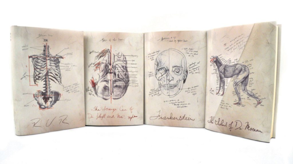
1. Penguin Classic Book Covers
Love the original and detailed illustrations. Simplistic with few colors used, but it attracts attention with great illustrations and ‘hand-made’ feel.
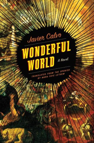
2. Wonderful World by Javier Calvo
Great colors, great background and simple text that uses 2 fonts and colors (some contrast that matches well between fonts).
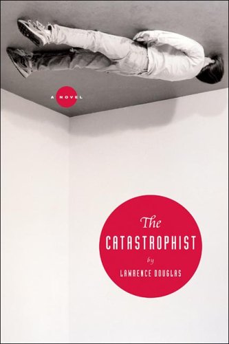
3. The Catastrophist by Lawrence Douglas
Absolutely brilliant. Funny, conveys the message and uses a minimal amount of stuff. One of my favorites of the bunch!
![Seduced: A Hannah Smith Novel, by Randy Wayne White (2016). “[Florida’s orange] trees are dying at the root, weakened by infestation and genetic manipulation, and the only solution might be somehow, somewhere, to find samples of the original root stock. No one is better equipped to traverse the swamps and murky backcountry of Florida than Hannah, but once word leaks out of her quest, the trouble begins.” (Website)](https://i.pinimg.com/564x/a2/a9/ed/a2a9edeff0a9920645e1f60818964292.jpg)
4. Seduced by Randy Wayne White
Amazing colors (evocative), author’s name is big so it’s easy to read in the small thumbnail (if the author sells books ‘on the name’ alone that matters). The plane is small but still is placed so well too that it’s easy to see and tell what the book is featuring.

5. Der Kreide Mann by C.J. Tudor
Awesome cover. Typography is main effect and visual supports it well. Love the color scheme. The image is a bit blurry here but that’s because it’s a picture from online and not an original cover (so it’s not a blurry one originally).
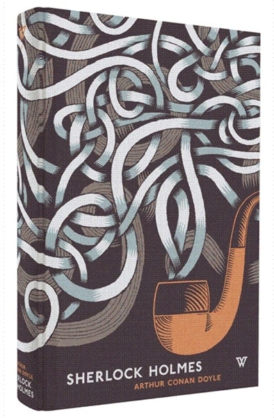
6. Sherlock Holmes by A.C. Doyle
Great illustration and interesting use of sans serif font to go with it (adds modern feel to this). Dig it!
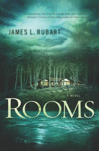
7. Rooms by James L. Rubart
Great feel here. Well manipulated photos and fitting font choice.
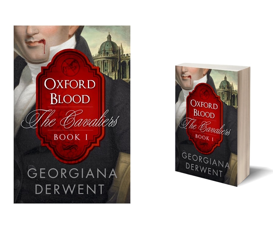
8. The Cavaliers by Georgiana Derwent
Great typography. Another example of how contrasting fonts work even without many effects created on them. Love the red badge here too.
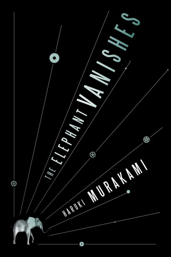
9. The Elephant Vanishes by Haruki Murakami
Great use of different text placement and lines. Bold.
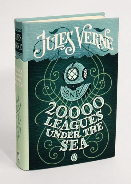
10. 20,000 Leagues Under the Sea
Great colors and great illustration. Ornaments incorporated so well.
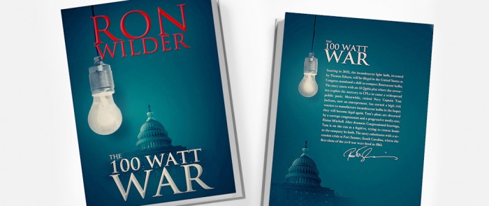
11. The 100 Watt War by Ron Wilder
Awesome background and typography. Again, quite minimalistic, not too much colors but it works really well.
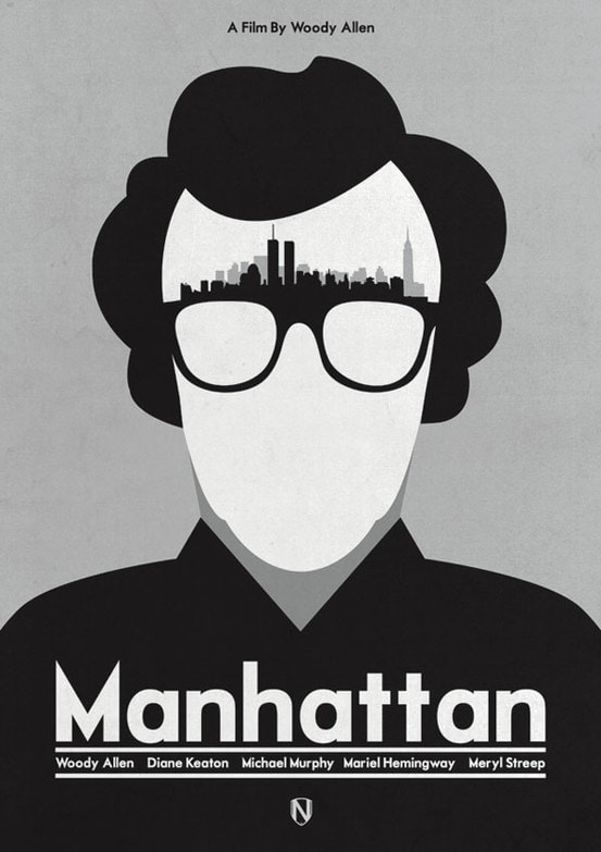
12. Manhattan by Woody Allen
Not sure if it’s a book cover, probably not, but I just had to include this brilliant use of Woody’s face and skyline of Manhattan. Creative!
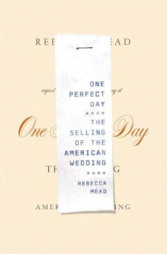
13. One Perfect Day by Rebecca Mead
So original, love how they used the receipt here. Adds that ‘commercialized’ feel that book is talking about.
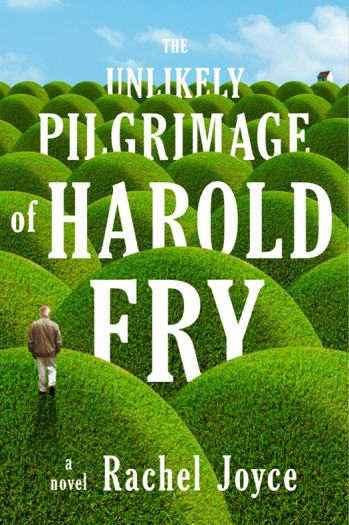
14. The Unlikely Pilgrimage of Harold Fry by Rachel Joyce
Gorgeous, vibrant colors and simple text integrated into the artwork. Great effect.
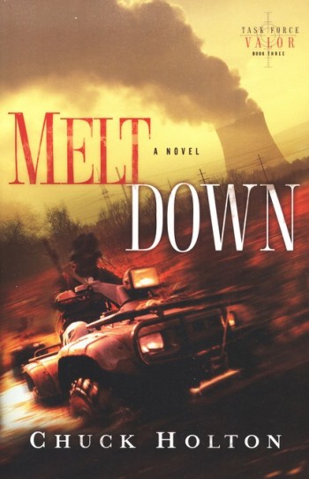
15. Meltdown by Chuck Holton
Great effect of movement and action here. Great manipulation.
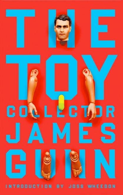
16. The Toy Collector
Great simple typography. Lots of text but it’s all balanced well, still readable with all the toy parts too. Great colors!
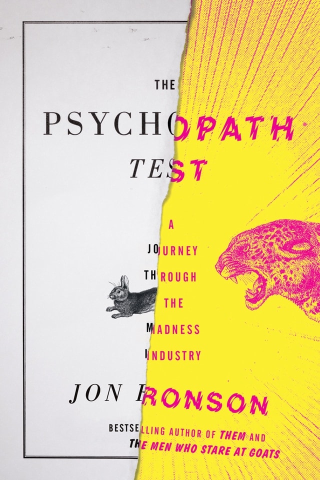
17. The Psychopath Test by Jon Ronson
Love the contrast of it, great colors and font choices. Definitely conveys the idea for the book – the duplicity and prey/predator dynamic.
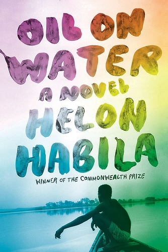
18. Oil on Water by Helon Nabila
Love the colors, simple image and how they used typography here.
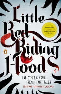
19. Little Red Riding Hood
Awesome typography. Possible handrawn and then scanned to bring it to computer and trace it there.

20. The Flame Alphabet
Geometric shapes well done, even creates a 3D look.
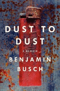
21. Dust to Dust by Benjamin Busch
Great stock photography use. Another simple font used. It almost shouldn’t work with such simple design but even this overly simplistic approach doesn’t kill the cover.

22. Not a Sound by Heather Gudenkauf
A really great atmosphere for cover and well-done text.

23. Too Close to Breathe by Olivia Kiernan
I love the color scheme and even tho text is simple, it still works well. The cover is quite ambiguous but still gives the Thriller vibe well.
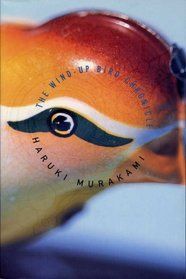
24. The Wind-Up Bird by Haruki Murakami
Unreadable text in a small thumbnail but the picture is so original that it’s no problem. Concept wins over the readability, it just looks so ‘weird’ that it can become its advantage.
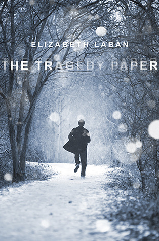
25. The Tragedy Paper
Love typography here. The effect is good and not often used in fear of illegibility. Great use of two colors only.

26. The Gone World by Tom Sweterlitsch
A risky design for Sci-Fi cover. It can be hard to pull off inverted colors on covers but this one is done well.
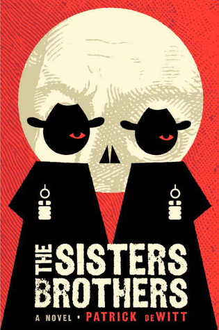
27. The Sisters and Brothers by Patrick DeWitt
Love how the circle and those two characters are used to create skull effect when watching from further away or as a small thumbnail.
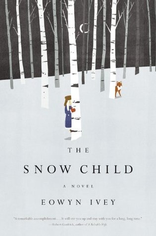
28. The Snow Child by Eowyn Ivey
Gorgeous illustration, cleverly hidden child gives it that childish feeling and colors are stunning.
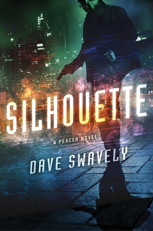
29. Silhouette by Dave Swavely
Managed to manipulate multiple pictures well and not have any rough edges to it.
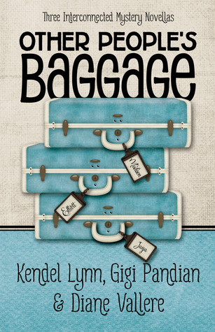
30. Other People’s Baggage
It looked more like a non-fiction cover when I saw it and that’s why it attracted attention. Good colors and nice concept.
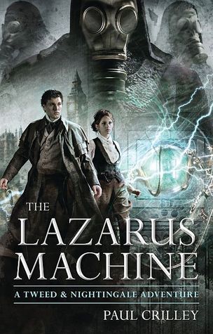
31. The Lazarus Machine by Paul Crilley
Well manipulated pictures and Photoshop effects. It has a ton of elements which can cram up the design too much but even with lots of words on cover it still works. Very well done in that regard.
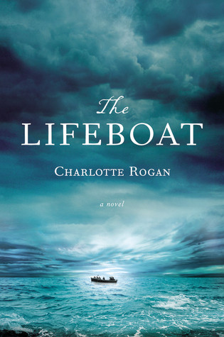
32. The Lifeboat by Charlotte Rogan
Totally loving it. Great colors, great, dramatic sky and good use of one main element in design (boat). The text is really good too.
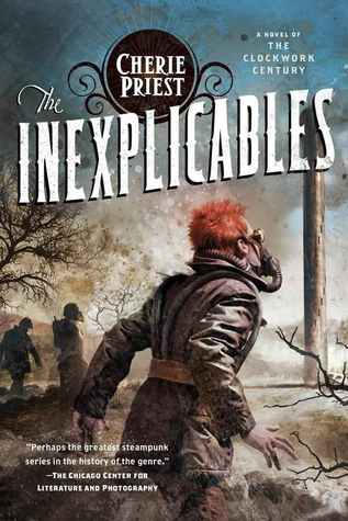
33. The Inexplicables by Cherie Pries
Great illustration, use of textures and nice text. Red hair stands out too and attracts attention among other covers.
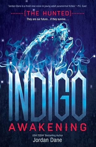
34. Indigo Awakening by Jordan Dane
Not sure about the font choice but effects and illustration are great.
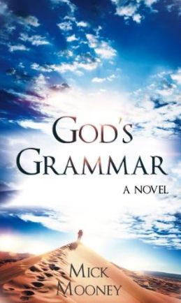
35. God’s Grammar by Mick Mooney
Awesome sky just grabbed me. Sands match it well, and it has the feel it needs to convey. Might be the only cover here designed by the author himself (who is a graphic designer himself so he had an unfair advantage here). Great contrast, colors, and concept.
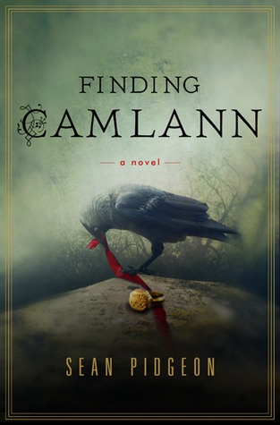
36. Finding Camlann by Sean Pidgeon
Great manipulation, great colors and bird. Love the feel of it.

37. Cruel Beauty by Rosamund Hodge
Stunning cover. Superb… love the colors, love the running woman which adds drama.. and the rose is blended in so well. Really cool, original idea. Fantastic cover.
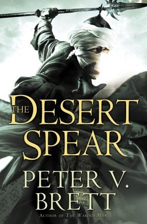
38. The Desert Spear by Peter V. Brett
Great Photoshop work and good typography.
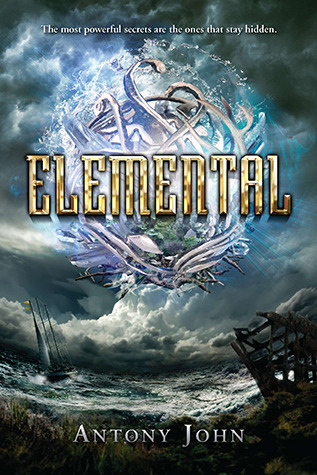
39. Elemental by Anthony John
Great manipulation of elements and pictures.
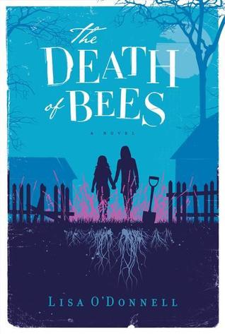
40. The Death of Bees by Lisa O’Donnell
Love the colors, love the illustration. That shovel adds something to it, some edge and danger, maybe to match the ”Death” in the title?
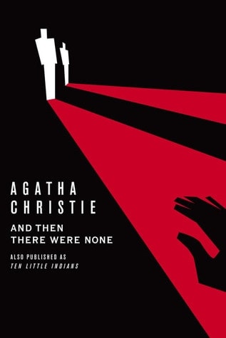 41. And then there were none by Agatha Christie
Simple. There is a fine line between simple/genius and simple/not-done-yet. This one looks great.
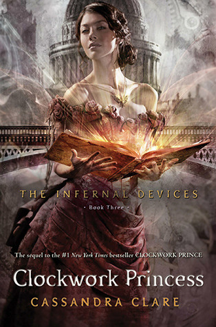
42. Clockwork Princess by Cassandra Clare
Not liking the font choice as it is missing something, maybe the effect doesn’t match it too but the stock photo of girl and effect with the book is awesome.
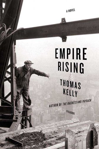
43. Empire Rising by Thomas Kelly
Love the perspective of the text. Great picture too (that’s where my love for skyscrapers show haha)
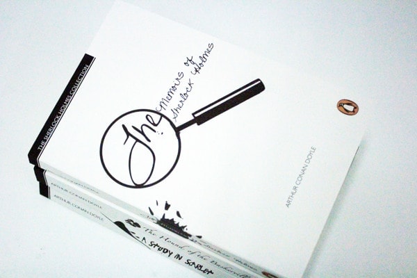
44. The Memoirs of Sherlock Holmes
Another Holmes cover and another beauty. Love how simple it is yet it still conveys main thing about the character.
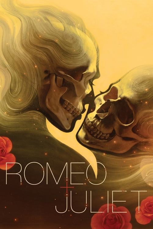 45. Romeo and Juliet
Just wow… the illustration and colors are great. You wouldn’t expect skulls on a cover really.. except a Horror one.. but this is superb.
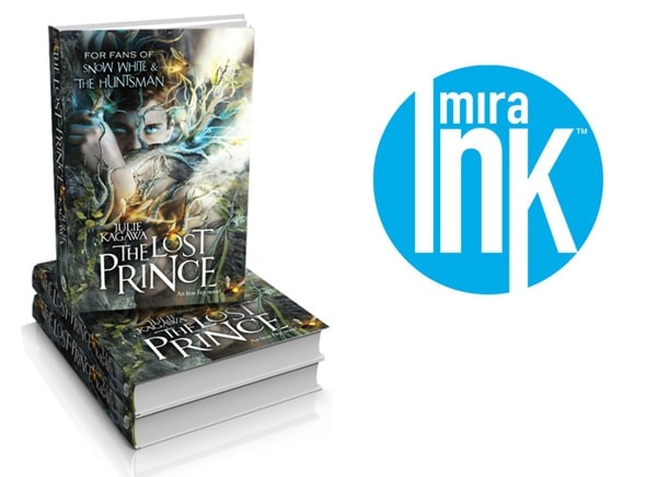
46. The Lost Prince
Great photomanipulation and colors.
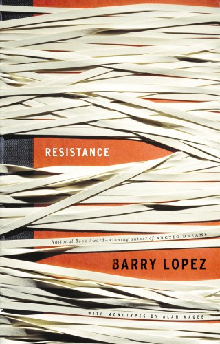
47. Resistance by Barry Lopez
Love the idea and concept of it. It’s not the most beautiful cover in the world but it is original!
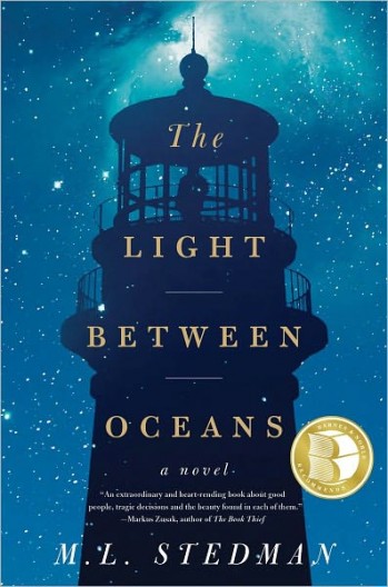
48. Light Between Oceans by M.L. Stedman
One of the best covers of last year. Great colors, great use of the lighthouse. Typography isn’t original but works nonetheless.
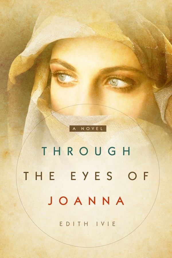
49. Through the Eyes of Joanna by Edith Ivie
Great colors, simple text and use of texture.
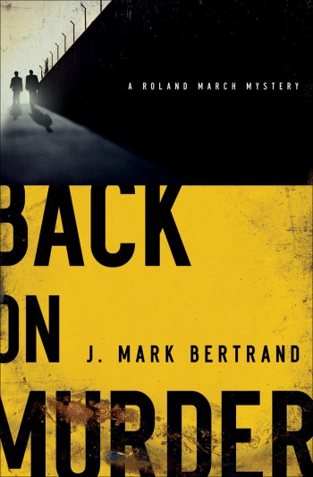
50. Back on Murder by J. Mark Bertrand
Great text, colors really suit the title. Not your typical placement of elements too.

51. Magicians Impossible by Brad Abraham
A cliche dark silhouette cover that is done well. Cliches do become for a reason, they work. And this cover is a good example why. The cool smoke effect adds nice differentiation and untraditional title adds a nice flavor too (the wave effect of it).

52. Priest of Bones by Peter McLean
Awesome example of how rightly picked fonts tell the genre and look cool. No need for more effects on them. Great cover.

53. The Past is Rising by Kathryn Bywaters
Really good cover. At first, she captures the eyes, then text, then the guy. A good example of how design can ‘drive’ the eye on a well-structured cover.

54. The Long Drop by Denise Mina
Wowser… great effect and design work for visual.

55. Swan Lake by Anna-Marie McLemore
Beautiful cover. Very elegant, great colors (blue goes to white then red).

56. Don’t Cry Murder by Jake Patterson
Awesome colors. Very current with design trends of 2018 and bold choice.

57. The Thought Cathedral by Nathan Williams
Love the movie poster feel. This cover has a great way of integrating multiple different visuals without cramming it.

58. The Old You by Lousie Voss
Fantastic. One of the best visuals on a book cover I’ve ever seen and it’s so simple yet so so powerful. That hand reaching out. What a way to create mood!!! Can’t rave enough about this cover…

59. The Cliff House by Amanda Jennings
So simple, yet so good. A perfect example of how an image can be paired with simple text.

60. Curtain Call by Denise Grover Swank
Awesome way to create depth with the broken glass and title behind it. Top job with Photoshop manipulation.

61. Serial Killer Z: Infection by Philip Harris
This whole series has amazing designs. Awesome Photoshop skills manipulated visuals together so well. The people ‘in’ the ‘Z’ letter (and water) look so cool.

62. The Fifth Gospel by Ian Caldwell
A great example of how texture use spices up the cover without overloading it and making it too gritty.

63. Double or Nothing by Craig Shaefer
Fantastic Photoshop skills. Love the title treatment and slanted placement. The whole series, again, is worth looking at as it’s brilliantly designed.

64. Point of Control by Drake Green
Another example of how typography can be a focal point.

65. Rise Again Below Zero by Ben Tripp
Nice example of how un-standard text placing and perspective can work.

66. Monstrous Lies by Shina James
Another great Photoshop composition and typography.

67. Juniper Unraveling by Keri Lake
Amazing Photoshop and the atmosphere it creates. Superb!

68. Secret Hunger by Satin Russell
An absolute trend in 2017/2018 with person/silhouette and a visual blended into it. Great cover, great colors.

69. If Angels Fall by Rick Mofina
Awesome, awesome, awesome typography and colors. Evocative cover.

70. Insanity by Andre Gonzalez
Very simple, but very well done. Interesting. Intriguing.

71. Cause of Death by Patrick Logan
Simple visual but says all it needs. Great colors too.

72. 37 Hours by J.F. Kirwan
Big bold typography with small visuals (plant and diver) supporting it well to create a great cover.

73. End Game by L.T. Ryan
Another cover that is a perfect example of current trends in thriller covers. A modern update on the silhouette cliche.

74. Twisted by Sarah Reeves
Monochromatic covers (one color) can be too boring but this one works well, with great typography too. It’s not just red color overlayed over images combined so it’s more interesting and contrasting.

75. York by Laura Ruby
Fantastic work with 3D elements for the title and other parts of it. Looks very realistic and cool.
More Useful Resources
For some more inspiration you should visit Kindlepreneur’s article – Book Cover Ideas Every Author Can Learn From
Hope you enjoyed this collection of book covers and short thoughts on why they work. Hope this gave you some insights into book cover design too and helped you learn more. If you’d like me to add more covers and update this post in the future, let me know in the comments below!
50 Beautiful Fiction Book Cover Designs | Rocking Book Covers
This is awesome!
Great compilation!
Thanks Steve! 😉
This is a fantastic, instructive article. Your comments pointed out some items I would never have noticed, for instance, the guy with red hair. I love that you showed what you didn’t think worked as well as showing what did. A lot if informational articles forget to tell us what is wrong as well as what is right.
I know you posted this a long time ago, but just saw that you included my design for Aghorst Aoman. Thanks so much!
You’re welcome Scarlett! You deserve it! I’m a fan! 🙂
Silhouette looks like one of your covers!
Haha a little bit but mine would have a bit more texture probably! But it is a good cover for sure!
I have taken note of a few designs that I found might be useful for my manuscript.
Book has taken a while in the writing of, so will bookmark this page and check back again.
Ciao
Sounds good Judith! Glad you found the article useful and definitely keep coming back to it as you need!
Enjoy writing! 😉
Adrijus
Do you know who published the Romeo and Juliet? I cannot find it.
Nope, sadly. There are many of those too so it’s hard to find…
This is a SUPERB article, Adrijus. Thank you. Now, I’m hunting you down for my next cover!
Hi! Great to hear! Glad you love it and I hope we get to collaborate on a cover in future for sure. 😉
Best,
Adrijus
Hi Adrijus,
Thanks for including 3 Ebook Launch cover designs in your post 🙂 (The Thought Cathedral, Insanity and Twisted)
Take care
No problems! Well deserved. Keep up the good work!
Adrijus
Adrijus, you’ve written an excellent article. Thank you so much. Now I’m looking for your next cover!