As an indie author, you probably care about your book covers a lot. Great! But it’s not easy to judge book cover quality for those with no education in design. This post will try to be your cheat sheet and help improve your choices. Use this quick checklist to run through when evaluating a cover (whether premade or custom book covers). Something to keep in mind whenever getting a new cover or considering a redesign of current covers.
Let’s get into it:
What Makes a Good Book Cover?
Definition of a good book cover varies according to person probably but for the sake of this article we shall use this:
A good book cover communicates the right genre, and is easy for readers to understand while looking as good as possible visually in order to catch readers’ eye.
Things Good Book Covers Must Have
1. Right genre communication
Absolute must. I hate to say it as a designer, but it’s more important than great-looking design. If the cover is a bit bland, a bit boring but at least communicates the genre very clearly, it’s going the long way in the right direction.
Obviously, ideally, you’d have an amazing design AND genre communication. But if let’s say, your budget is limited and you can’t hire a designer you want with incredible skills, focus on at least getting the cover that nails, nails, NAILS the genre!
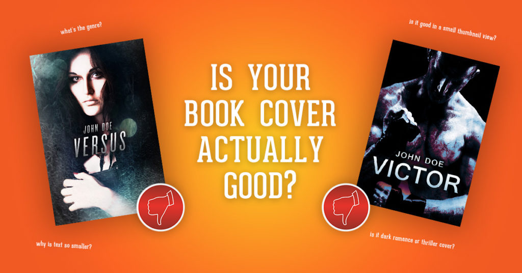
Here are 3 of my old premade book cover designs where I messed up genre communication:


Lets consider each cover:
A) Versus – could be a fantasy, UF cover or even occult cover with additional visuals communicating the genre but it has nothing other than the girl so it’s not a great cover.
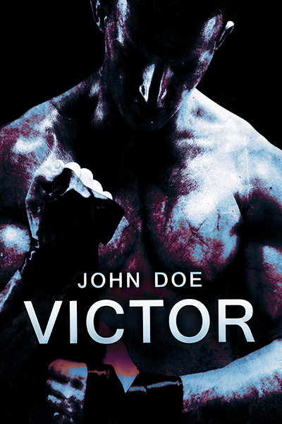
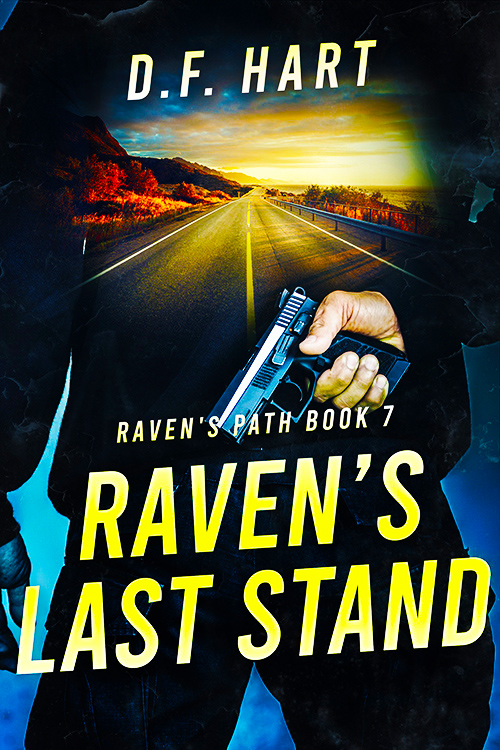
B) Victor – I loved the visual and the pose, dark and gritty style… but it’s genre is unclear… it could be a thriller or a dark sports romance. The separation would come from supporting visual added and fonts chosen.
C) VIP – yeah… don’t know what was I making. It’s neither a thriller nor romance. Please shoot me!
P.S. Another difference can be the country where it’s published– in UK thriller covers don’t have guns held in the hero’s hand. While in US that’s the main cover cliche. Why the difference? Seems like UK police aren’t carrying guns as much so that makes sense. When buying a cover, it might make sense to check the main country you will publish in and if there are such differences.
2. Good typography
Typography means text of the design and it is crucial and can cause you lost sales. The title must be readable (but that doesn’t always mean it’s super big). And the author’s name would be good to be readable but is not a must. Especially for the less known/newer author.
Here is an example of cover with bad typography – the cover visual is really cool! But the author name and title are barely readable. Author name is poorly done in particular!
3. Contrast, Vibrancy and Colors to match genre and book tone
Most covers should have good contrast between elements and vibrant colors, which will prevent a bland-looking design. Unless you are specifically creating a moody cover, blandness is an enemy. Take a look at the difference in the same cover – the first option is the normal cover, the second one is with the contrast and vibrancy stripped out from it and the last one is with contrast and vibrancy raised to the max.

The bland grey color is not a friend as the main color on the cover. It rarely should be dominant on the cover (unless it fits in because the cover is moody and conceptual).
A good amount of contrast brings out all the colors well and makes the cover more vibrant, thus more interesting.
BUT too much contrast and vibrancy can also become jarring. So it’s a balancing act.
4. Correct Lighting
One of the details that shouldn’t be overlooked, is if all the lighting and shadows are done right. That is if the sun shines from the right side on buildings in the background of the cover then it should be the same on the main character. If they differ then you can tell that the designer didn’t do his job well.
Same for shadows, they have to be falling in all the right direction. In some cases, the mistake is DIYers add a figure of a person but forget to add a shadow on the ground.
5. View in a small thumbnail
It’s sad, but the covers are mostly seen in a small thumbnail.
Since most of us buy them on Amazon, that’s where we see them. And they only show small thumbnail-size covers which hides a lot of intricate cover work and makes the cover harder to read.
Thus a very important thing is to have your title readable at the small thumbnail and a visual that isn’t overcrammed with symbols, elements, and text and isn’t too confusing. We have milliseconds to make the first impression with the cover so confusing cover could hurt.
Milliseconds! People browse and scroll fast! Showstopping cover has to work in a small view. An example of a great cover with a botched text job is this, text completely disappears in small thumbnail.
6. Convey Mood and Tone of the book
A sign of a great cover is also conveying the right tone and mood for the genre. Things like chosen colors, fonts, other design elements and even poses of people added to cover should communicate the right genre of sub-genre. For example, a small thing like a running guy would communicate an action thriller better than a guy standing still and not holding a gun.
Or a steamy romance cover would have a couple in different poses and proximity than a sweet romance.
Hope you enjoyed this checklist. If so, let me know if you want me to turn this into an actual downloadable document so you can run these quickly through your mind any time you look at a cover and you will increase your chances of finding a winner!
I am amazed at how many covers I can’t see on my Kindle. Too many dark backgrounds and most fonts aren’t legible or show up at all. I have to go on my desktop to buy a book or I have no clue what I am looking at. So all this is a moot point. Plus I see a lot of covers with the same background art too
Great point! I know what you mean, seen that error too.
I’m not sure if you mean that these 6 are moot points tho, they would actually help to prevent that issue.
This article touched on good points. I have some background in graphic arts and illustration, and I agree with everything. Well done article, concise, quick to read, and the good/bad examples especially helpful.
Thanks for the comment! Glad you liked the article. 😉
Excellent help for a first-time cover buyer like myself, thank you.
Happy to hear! Glad to help 😉
Good luck!
Adrijus
So well-written, simple and clear. I’ve seen so many covers that look cool but are unreadable.
Thanks! Glad you liked it! Good to hear!
And yes, a common mistake sadly. 🙂