So, you’ve completed the quiz. Here are the right answers to each question so that you know where you made mistakes (if you did). The right answer is highlighted in the picture and explained underneath it. Hope this helps! 😉
Question 1: What does a great book cover need?
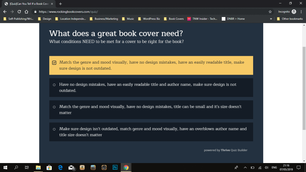
Explanation:
This one was most general and basically named all things needed for a great cover. So first option is right and all others were missing one or the other option. No.2 is missing most important thing – genre! No.3 – says that title size doesn’t matter which is the wrong thing and no.4 talks about overblown author name size, which is a myth authors can believe sometimes (but author name size only applies to the genre dominating folks, who are selling ‘on their name alone’), then their author names should be big and bold to capture fans easily.
Question 2: Which cover is better design-wise (for a Post Apocalyptic book)
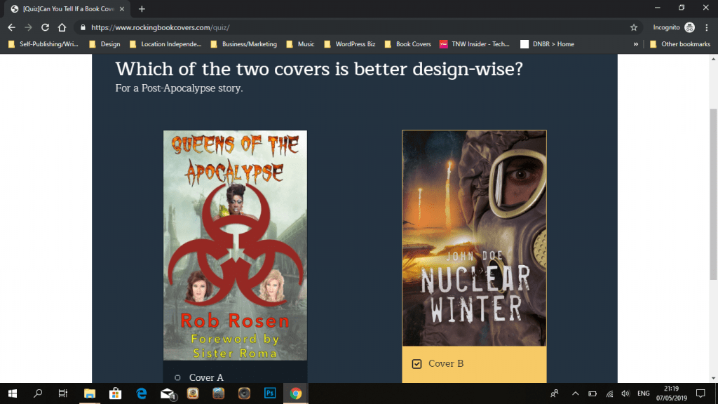
Explanation:
While the first cover shows genre with the radioactive sign quite well, it’s design is not as good. Sometimes simple is better and thus cover 2 wins. The first one has a harder to read text, bland background, and needs a bit more balancing in terms of text size, element size and a bit simpler title font (so it’s easier to read). Sometimes fancy fonts aren’t a great choice. Looking cool takes away from the readability.
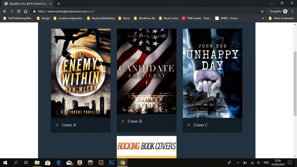
Question 3: Which cover is NOT matching the genre well (for a Military Thriller book)
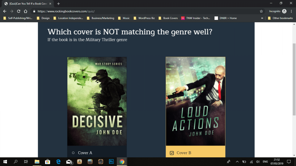
Explanation:
Both covers say thriller/action but the trick was in naming the one NOT working for the military theme. Thus the first one is right for the genre and the second one not. The 2nd one is more about secret agent/spy (fans of Hitman movie and games will recognize red tie and suit as a theme).
Question 4: Which cover is right for an EROTICA book?
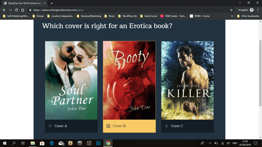
Explanation:
The right one is B because it has… Booty… 😀 Third one is a shifter romance subgenre (the animal featured on the cover is a clue for that) and first one is a very general romance cover. Nothing steamy there.
Question 5: What is the right order for these things (rank them from most important to least)
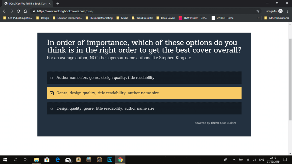
Explanation:
While I’m a designer and want the design to be THE no. 1 thing, even I have to admit that matching genre is more important than design quality. Both are a must, but genre importance beats everything. I’d rate them in the importance of 50/30/15/5 percentage wise probably. So option B is the right answer.
Question 6: What is wrong with this cover?
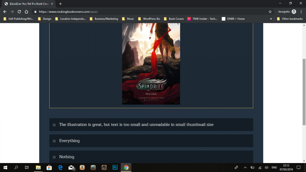
Explanation:
This one has a good illustration, but the text completely messes it up. It’s too small, even title is hard to read in a small thumbnail view, not to mention that author names are completely unreadable. Even with a good illustration, the cover fails here.
Question 7: What’s wrong with this cover?
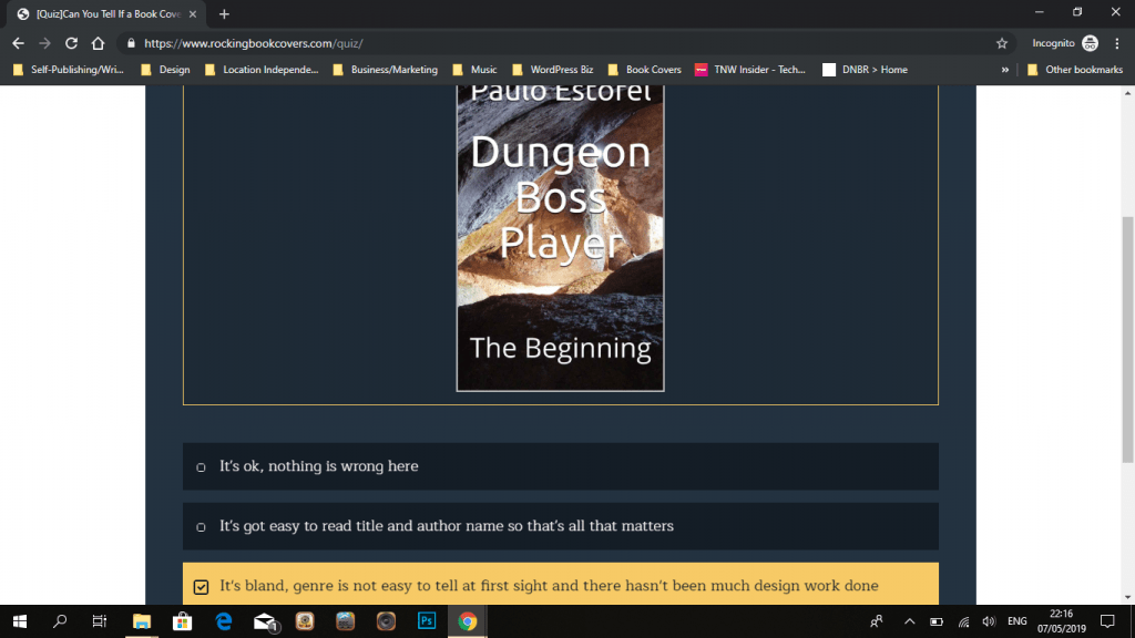
Explanation:
This one is bland, not very easy to tell the genre and there is no design work done at all, just a white text with a shadow added over a picture. A very standard low-level DIY cover look.
Question 8: What needs to be done with book covers in a SERIES
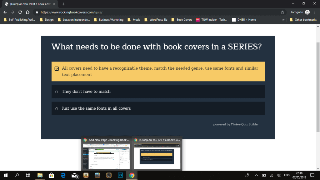
Explanation:
This one was about series covers and needs ALL the elements. It would be completely bad to not match covers at all when books are in a series, but at least matching fonts would be decent. For series cover branding ideas and tips read up this post.
Question 9: Which cover is good for a Thriller book?
Explanation:
I didn’t specify the subgenre thus all 3 covers were fine. Thus answer 4 was the right one.
Question 10: What’s wrong with this cover?
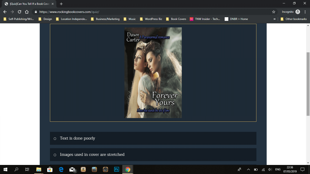
Explanation:
This one had a lot of issues. The girls are distorted (kinda squished together) , the text is again very simple and just added a shadow on it. The colors aren’t working well together ideally. And it’s a bit bland. Not sure what genre this is either (guessing myself it would be an LGBT cover but not sure what genre).
Conclusions
So, I hope you had fun. This was a various thing test, it doesn’t go deep into one genre or into distinguishing covers that are either good or great. I just wanted to ask some basic questions that an author should be able to answer. Getting 10 is very possible, but 8 or 9 is also great. That is a much more subtle difference sometimes and even harder to tell for non-designers. That might be my next quiz.
In the meantime, if you need more help with covers, read up different articles I have about them to learn what mistakes to avoid etc. You can find them in my Advice page.