As you probably agree, book cover design is a crucial marketing tool for your book.

It was true before Amazon started doing less and less organic book marketing with its Also Boughts and emails, and it’s even more true now in 2024 as book marketing is only getting harder, thus only increasing your cover’s importance!
But can you tell when a book cover is great, good, or bad?

Distinguishing design quality is the number one skill authors sadly don’t have (not your fault, no training).
Whether you’re looking to hire a book cover designer, buy a premade book cover, or to DIY your cover, this is something you must improve as an indie author, especially if you are worried that your current book covers aren’t up to par.
After reading this you will be better at spotting and preventing these book cover design mistakes!
So without further ado, here are the blunders I’ve observed in 9 years as a book cover designer:
- Genre miscommunication
- DIY-looking cover
- Too much subjectivity
- Weak hierarchy/structure
- Too many fonts
- Bland/boring design
- Completely unreadable in small thumbnail size
- Too much text and too many elements crammed into it
- Low-quality images
- Copyright-protected images
- Too much feedback from outside
- Author name size myth
While some of these are more subtle issues that won’t kill your book sales, others can cause bad reviews from unhappy readers, or prevent you from getting a BookBub feature or book bloggers ignoring it for reviews.
These are very common on DIY covers and even on some covers designed by new designers who are still learning the art of book cover design.
Let’s analyze them in a bit more detail.
The 12 Book Cover Design Mistakes
1. Genre Miscommunication
This can be a subtle mistake, but one with BIG consequences.
Your cover might communicate that the book is a psychological thriller while your book is a high-octane action thriller with lots of chases and shooting. The expectations readers have for each are different, and when they buy the book, you may get a negative review from readers who are unhappy that they were misled (unintentionally misled).
Not only you’re missing out on reaching the right readers who will love your book, but you might also lose sales because of worse reviews.
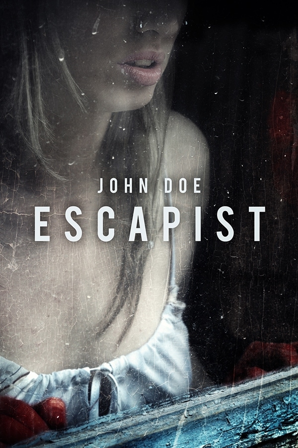
The risk of this mistake is highest when DIY-ing or buying a premade book cover since it’s easy to fall in love with an idea or design, instead of staying objective. We all have biases and blind spots so having a person or writer mastermind in your genre with an outside look helps.
Examples of bad covers are below, they all focused on the visual too much but don’t have details that strengthen the communication of a genre:


2. DIY-looking Cover
This one is often the easiest mistake to tell because some covers are just a disaster. Like the few following ones below.


But some covers have subtler signs of DIY and are often harder to tell (esp. coming from newer inexperienced designers). This tends to be mistakes of misplaced text (too close to the edges of the cover), text too small (you’ve just seen those 3 first covers in the previous point), and a bad hierarchy of design elements (more on this on this at #4), or stretched images that look unnatural (like cover ”Forever Yours” just above this paragraph, the ladies are squished).
3. Too Much Subjectivity
This happens when an author’s personal preferences influence the design too much. Instead of designing a cover that fits your genre needs, an author sometimes wants a particular color or visual element on the cover that doesn’t fit the genre or is just a plain bad design choice. Here is an example of someone just using family vacation pictures for the cover, not a good idea (pleasing family members over the real readers here):

Cover designs shouldn’t be boring or too cliché. Adding an interesting or different element can work, but when suggesting ideas for cover designs, don’t get too attached to anything…
A designer should never be dismissive of the author’s ideas and not explain anything. A good designer is not only paid to design but is also the author’s guide to what works and what doesn’t, so the designer needs to at least explain in some detail why the color or design element on a particular cover doesn’t work.
4. Weak Hierarchy/Structure
Every design should have a simple, clear hierarchy of elements.
Whether it’s a book cover, website design, or poster, how design is laid out impacts how readers perceive it. This is one of those design things that non-designer will not spot and that’s why DIY covers can suck.
A good design can drive the eye from one element to the other in the order needed. It also makes sure that elements do not create a mess that’s hard to understand.
Design as an art form has its own structures and hierarchy options.
Structure
All book covers have text and visual layout patterns which are repetitive once you learn them and recognize those that don’t have them. Not using these layout patterns creates a weak design.
Breaking rules for the sake of breaking them isn’t always the best thing either(if you like breaking them). Breaking these patterns can work if they are done by those who already know the rules well. A clever new pattern can result in a worse design than keeping it simple. Sometimes a small, simple tweak of a usual design structure will produce a better result than reinventing the design structure.
Some structure samples and their tweaks:


Structure One – Title in the middle and author name below it with the visuals around them.
As you can see, the left one is a standard placement, straight-line text with nothing too fancy. It’s a good book cover that does its job well, while the one on the right takes the same structure but puts it at an angle. The title, quote, and figure are not lined up straight, but the author’s name and tagline are, which makes for a nice change and a beautiful cover.
Structure Two – Visual in the middle and the text on top and bottom, title or text interchangeable.
This is a common design structure, probably what most would call a ”normal” cover.
Both covers are great and do their job genre-wise and both look awesome. The cover on the left plays with the structure, showing more dimension with the magic energy coming out of hand along with the title being on different layers of paper. Again, a simple tweak creates an exciting cover.


There are more structures, like placing the visual on top while the title and author name go below it, or a flipped version of that, etc. It’s out of scope for this article but I might write something up if you’d like (let me know in the comments).
Hierarchy
Hierarchy is often different on every cover, which means all design elements — title, main visual, author name, supporting visual — are laid out in a way that matches their importance.
On the cover of Ruta Sepetys’ book, the author’s name is the first thing that stands out on the cover before the eye is drawn down to the visual, and only then do you notice the title. It’s even hard to read in a small thumbnail, but since the author’s name is the main selling point, that is done deliberately. Thus the main element is the name and it’s the biggest, the visual is the secondary element, and the title is last. I would recommend a more readable and legible title tho, though, for this cover too. It’s possible to make it so by moving the visual a bit upwards which would give more space for a bigger title.
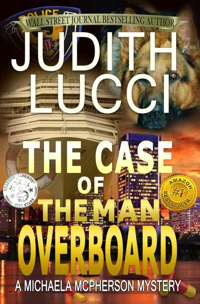
Example of cover with a very weak hierarchy:

As you can see, the title and author name are the same size. The other text is hard to understand with different sizes and colors, and it’s too much to be a simple tagline that intrigues the reader. It’s like a blurb and thus it’s too long.
5. Too Many Fonts Used on the Cover
Never use more than 3 fonts. That can create too much of a mess. See here, I count at least 4 fonts:

The general guideline for good typography — use two contrasting fonts. Sometimes a third font is okay and can be used. But if you use a third font, it should be used as a tagline or supporting text, not the main message.
Often you can just use one font and change the weight or thickness, bold and regular, regular and italic, etc.
If your designer sends a cover with more than three fonts, ask why! They better have a good explanation.
6. Boring and Bland Design
Sometimes a cover can have the right visual for the genre, well-made typography, and have everything right, but if it lacks contrast and vibrancy, the cover will not get as much reader attention as possible. Bland designs drown in the sea of great covers which tend to be quite vibrant in many genres these days.
Vibrancy is essential in genres like fantasy, YA, urban fantasy, and science fiction, where most covers are vibrant and colorful. Contrast is imperative for covers. It’s definitely joined the thriller/mystery scene too.
NOTE: If the goal for the cover is to have a more abstract or melancholic cover, too much vibrancy is not needed. This isn’t a must for all covers, but you better be aware of the trends in your genre here and understand the choice made.
7. The Title is Unreadable in Small Thumbnail Size
The book title should be easy to read in the small thumbnail size on Amazon.
While the cover visual might be good enough to attract attention on its own, an intriguing title multiplies your chances of getting the reader to click through your Amazon book page. They should work in tandem, not one or the other.
The size of the author’s name can range from being legible(not easy to read at first glance but readable), to being almost as big as the title so it’s easy to read at once.
For example, here is a premade book cover I did years ago when I was still new and typography was my biggest weakness. You see the left cover has small text, especially a small author name, and when I updated it by only changing the size and adding a tagline it became better.

And these are NOT the small-size thumbnails Amazon shows, so imagine the small text then. It would be completely hard to read quickly and it wouldn’t be working in tandem with the visual.
8. Too Much Text or Too Many Visual Elements
Too many things on the cover become too hard to understand. It is easy to lose structure and hierarchy.
Never cram too many visual symbols from the story. Don’t include every important person, gun, cityscape, religious symbol, etc. The cover doesn’t need to display all the story elements or depict a scene in detail. Here is an example of a cover with too many elements:
Conveying the right genre or subgenre and the feel of the story is more important than depicting intricate details of any one scene. The purpose of the cover is to intrigue the reader to buy the story, not to show or spoil the story.
For covers that need to be abstract or simple(think Non-Fiction), this usually means a minimalistic design with only one visual and matching text. One cool visual is often more than enough.
9. Low-Quality Images
Book covers that draw readers’ attention have to have exceptional-quality images. No tiny images taken with an old phone or small images found on Google. That will show amateurism and create the impression that the author didn’t invest enough effort into it(even tho it may not be true).
If you need a print book cover made too, the images that are too old and scanned poorly show will not work, because images like these can also get pixelated, and screw up the cover. Not many things scream DIY more than pixelated images.
NOTE: It is perfectly fine to send designers reference images that are low-quality. That’s good for us to see and know what you want. We won’t use them for the final product.
10. Using Copyright-protected images
Do not Google things and slap those images on the cover!
There are some things you can’t use on book covers because they are copyright-protected and you might get sued for using them. For example, if you need a sports car, do not use a Ford Mustang image, the Mustang logo is copyrighted and can’t be used unless you get expressed written permission from the Ford Motor Company’s attorneys (good luck with that).
Some places are forbidden to be used on covers, like the Eiffel Tower (due to the night lights on the tower being a copyrighted design, not the tower itself). To learn more about restrictions for things go here:
https://www.shutterstock.com/contributorsupport/articles/kbat02/Known-Image-Restrictions
Another kind of image not to use is Editorial images and they are only allowed for editorial use, like blog posts, NOT in commercial projects like book covers.
Good Copyright-Free Images
A good source of free images that can be used for covers is the Creative Commons. Some need attribution, some don’t, and there are different license types here as well. Learn more at:
https://creativecommons.org/licenses/
Some stock photo sites also offer free images that can be used, but since they are available to everyone, everyone uses them so they lose their originality.
The best option is to stick to professional stock photo sites or do a photo shoot, which can get expensive(so it’s not for everyone).
11. Too Much Feedback from Outside
Getting feedback on your cover is important. You should get it before even choosing a cover.
But…
Don’t ask too many people about it. It’s best to have five people who know the purpose of a cover, like fellow authors in your genre or designer friends, but do not take design advice from too many people, especially from those who do not have any design education and skills.
I’ve moderated a book cover critique group for over a year, and while it’s a great initiative and it helps self-published authors, sometimes it is more of a distraction than a help. People have good intentions, but they are talking subjectively most often.
You might also get torn to different sides with tons of different opinions and create friction with your cover designer giving too much feedback. You should at the end of the day, trust them!
Voting?
Are voting competitions good?
They’re fun, if you conduct a vote sometimes a cover that is visually more impressive but less genre-appropriate can win, which is a mistake. While the general public may like it more from a design standpoint doesn’t mean it is the right tool for your book marketing.
My recommendation is to stick with a small group of professionals, and if you want to ask readers, ensure that you’re already giving them the right options to choose from in the genre before letting them choose a winner.
If you’re worried that an older cover isn’t working, email a designer or two you’d consider working with and ask for their opinion about the cover. Designers aren’t entitled to do it for free or go into a lot of detail, but most designers are helpful so you would get feedback from a professional.
12. Author Name Size Myth
There was a myth circulating the self-publishing circles that authors, even new ones, should blow up the size of their author name on the cover. It was supposed to be a way to trick readers into thinking that a big author name size signifies they are a well-known author…
…which is absolute b.s. nonsense!
It came from trying to copy what traditional publishers do for books, as you see huge author name sizes on covers for Steven King and other authors.
It makes sense for them because they sell more books based on the author’s name than on the cover or title. The name needs to stand out on bookshelves from far away too, so they play by different rules and focus on that. There is a small percentage of indie authors who also do it. Hugh Howey, yeah, H.M. Ward, yeah, Russell Blake, yeah, Mark Dawson, sure… Anyone who is already REALLY well-known in their particular genre should have their name as large as possible without messing up the design.
This is something that our industry has oversimplified and imagine it works.
Here is an example:
Arvydas Sabonis
or
ARVYDAS SABONIS
Doesn’t matter what size it’s at, you either know the name or not. If you’ve been a basketball fan for multiple decades, you might know this legendary Lithuanian basketball player from the NBA.
***
I hope this article helps and it has increased your ability to spot book cover design mistakes. I think the best and biggest benefit is that you can now pick book cover designers better! Hope your reaction to this was mainly:

Feel free to ask questions in the comments!
And if you need help with book cover designs, you should hire me 😉
Rock on!
I got 10/10, so I must be doing something right with my covers 😉 Number 11 was my biggest problem during design—I wanted too much feedback from too many people, and frequently received bad advice.
Good job!
And the feedback mistake is a bit counter-intuitive… it’s logical that you’d kinda want most feedback possible but in reality, not everyone understands what they are talking about and talk subjectively. It’s better to have less but more educated folks commenting. Even using author forums alone isn’t great for that, so many opinions. I always try to think ‘what bias does this person have?’ and where are they coming from, how much education they have and then judge their feedback on that.
the book cover info was extremely helpful. but did you seriously have to put your screenshot information in the answers?
Glad you found it useful! 😉
I’m not completely sure tho, what you mean by the other thing.
Does the quiz still exist?
No I’ve currently taken it down. I’ll bring it back in the future probably just need to renew it. 🙂